
Description
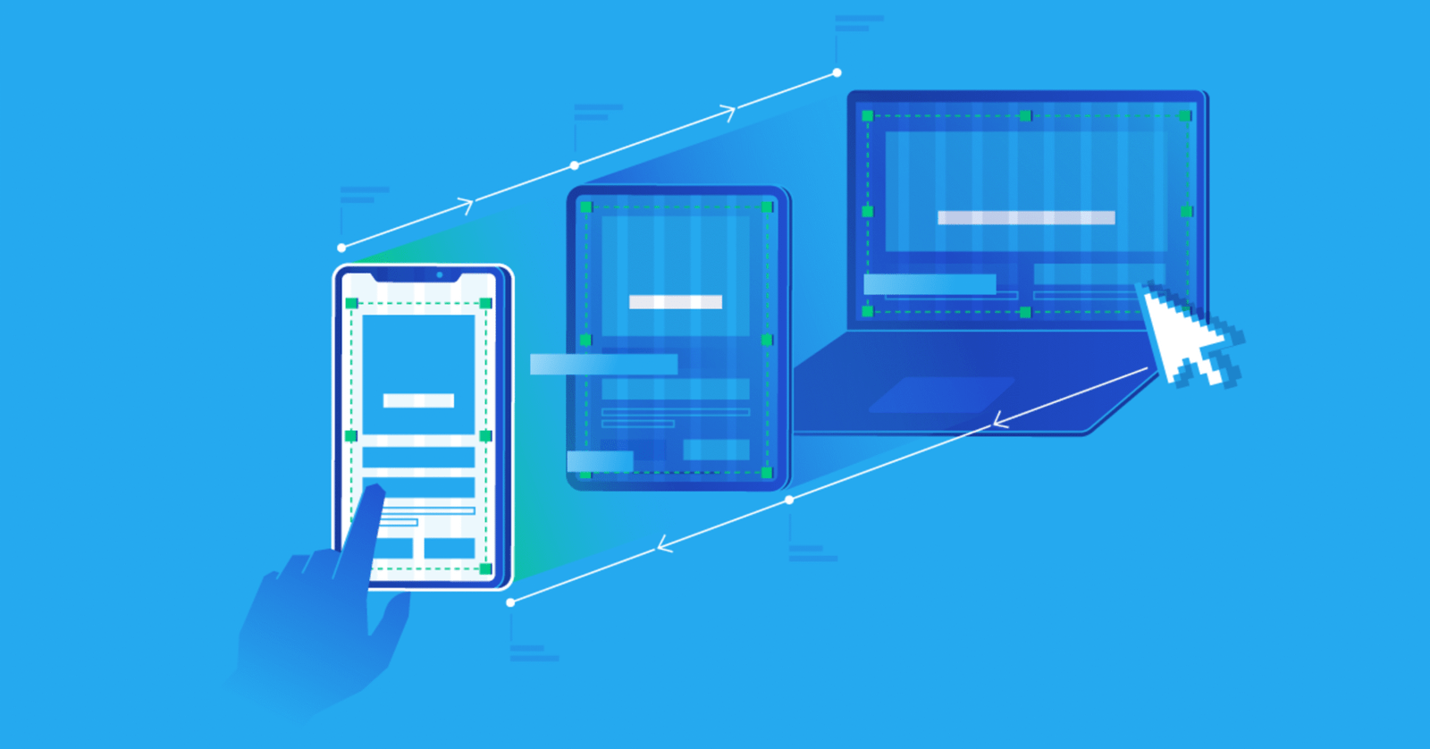
Perfect Website Display Across All Devices
In today’s digital world, ensuring your website looks flawless on all devices—mobiles, tablets, and desktops—is non-negotiable. Our responsive web design tool allows you to provide a seamless and visually appealing experience for every visitor. No matter the screen size, your website will adapt effortlessly, maintaining its functionality and aesthetic charm every time.
Why Responsiveness Matters
Statistics show that more than half of web traffic comes from mobile devices. If your website isn’t optimized for smaller screens, you risk losing valuable customers. Responsiveness enhances user engagement, reduces bounce rates, and boosts conversions by ensuring smooth navigation and uncompromised design integrity. Our solution ensures your site is functional and stunning, making it accessible and user-friendly for everyone.
Features That Drive Results
Our tool equips your website with cutting-edge technology to flawlessly adapt to all devices. Whether it’s scaling images properly, adjusting text for readability, or maintaining layouts, your content will always look its best. Built for simplicity and precision, the technology ensures quick optimization without requiring heavy coding knowledge. It’s perfect for site owners who value efficiency and quality.
Embrace responsive design and create websites that captivate your audience, no matter how they choose to access your content. With our solution, your website will never compromise its appearance or performance, ensuring a truly exceptional experience for users everywhere.


Reviews
There are no reviews yet.